
外观
CodeSnippet-WPF
渐变色类
<Border.Background>
    <LinearGradientBrush EndPoint="0.5,1" StartPoint="0.5,0">
        <GradientStop Color="{DynamicResource ContentAreaColorLight}" Offset="0" />
        <GradientStop Color="{DynamicResource ContentAreaColorDark}" Offset="1" />
    </LinearGradientBrush>
</Border.Background>

<Setter Property="Background">
    <Setter.Value>
        <LinearGradientBrush StartPoint="0,0" EndPoint="0,1">
            <GradientStop Color="White" Offset="0"/>
            <GradientStop Color="Yellow" Offset="0.5"/>
            <GradientStop Color="White" Offset="1"/>
        </LinearGradientBrush>
    </Setter.Value>
</Setter>

<!--渐变三角--
<Path Width="14" Height="32" Stretch="Uniform" Fill="Red" Stroke="Transparent" Data="M0,16 L14,0 L14,32 Z"/>
<Path Width="14" Height="32" Stretch="Uniform" Stroke="Transparent" Data="M0,16 L14,0 L14,32 Z" Margin="20">
    <Path.Fill>
        <LinearGradientBrush StartPoint="0,0" EndPoint="1,0">
            <GradientStop Offset="0" Color="Red" />
            <GradientStop Offset="1" Color="Yellow" />
        </LinearGradientBrush>
    </Path.Fill>
</Path>
透明度结合变换
<Grid HorizontalAlignment="Center" VerticalAlignment="Center" Grid.IsSharedSizeScope="True">
    <Grid.RowDefinitions>
        <RowDefinition Height="Auto" SharedSizeGroup="Row" />
        <RowDefinition SharedSizeGroup="Row" />
        <!--  SharedSizeGroup="Row" 共享行高度  -->
    </Grid.RowDefinitions>
    <TextBox x:Name="txt" Width="400" FontSize="26" Text="镜面反射" />
    <Rectangle Grid.Row="1" RenderTransformOrigin="1,0.5">
        <Rectangle.Fill>
            <VisualBrush Visual="{Binding ElementName=txt}" />
        </Rectangle.Fill>
        <Rectangle.OpacityMask>
            <LinearGradientBrush StartPoint="0,0" EndPoint="0,1">
                <GradientStop Offset="0.2" Color="Transparent" />
                <GradientStop Offset="1" Color="#44000000" />
            </LinearGradientBrush>
        </Rectangle.OpacityMask>
        <Rectangle.RenderTransform>
            <ScaleTransform ScaleY="-1" />
        </Rectangle.RenderTransform>
    </Rectangle>
</Grid>
自定义模板 动态属性替代不存在的属性 [Tag 替代 CornerRadius]
<Style x:Key="ImageRadioButtonStyle" TargetType="RadioButton">
    <Setter Property="Template">
        <Setter.Value>
            <ControlTemplate TargetType="RadioButton">
                <Grid>
                    <Border x:Name="PART_Border" Background="#212630" CornerRadius="{Binding RelativeSource={RelativeSource TemplatedParent},Path=Tag}"/>
                    <Image x:Name="PART_Image" Width="45" Height="45" Source="{Binding RelativeSource={RelativeSource TemplatedParent}, Path=Content}" />
                </Grid>
                <ControlTemplate.Triggers>
                    <Trigger Property="IsChecked" Value="True">
                        <Setter TargetName="PART_Border" Property="Background" Value="#FF4398FF"/>
                        <Setter TargetName="PART_Border" Property="Opacity" Value="0.5"/>
                    </Trigger>
                </ControlTemplate.Triggers>
            </ControlTemplate>
        </Setter.Value>
    </Setter>
</Style>

<--使用-->
<RadioButton Content="/AutoImageAnalysis;component/Resources/Icon/Scan/focus1.png"
             Tag="8 8 0 0"/>
Path
<Path Stroke="Red" Fill="Transparent" Data="M 0,0 L 5,10 L11,0"/>
// Stroke:边框颜色
// Fill:内部填充颜色
Combobox MVVM使用事件监听触发器
MainWindow.xaml
<Window x:Class="BlankApp1.Views.MainWindow"
        xmlns="http://schemas.microsoft.com/winfx/2006/xaml/presentation"
        xmlns:x="http://schemas.microsoft.com/winfx/2006/xaml"
        xmlns:i="http://schemas.microsoft.com/xaml/behaviors"
        xmlns:prism="http://prismlibrary.com/"
        Title="{Binding Title}"
        Width="525"
        Height="350"
        prism:ViewModelLocator.AutoWireViewModel="True">
    <Grid>
            <ComboBox Name="ComboBox1"
                      Width="200"
                      Height="35"
                      DisplayMemberPath="Value"
                      ItemsSource="{Binding ComboBox1Items}"
                      SelectedItem="{Binding SelectItem1, Mode=TwoWay}">
                <i:Interaction.Triggers>
                    <i:EventTrigger EventName="SelectionChanged">
                        <i:InvokeCommandAction Command="{Binding SelectionChangedCommand}" CommandParameter="{Binding RelativeSource={RelativeSource AncestorType=ComboBox}}" />
                    </i:EventTrigger>
                </i:Interaction.Triggers>
            </ComboBox>
    </Grid>
</Window>
MainWindowViewModel.cs
public class MainWindowViewModel : BindableBase
{
   private KeyValuePair<string, int> selectItem1;
   public KeyValuePair<string, int> SelectItem1
   {
       get => selectItem1;
       set => SetProperty(ref selectItem1, value);
   }
    public ObservableCollection<KeyValuePair<string, int>> ComboBox1Items { get; }
	public DelegateCommand<ComboBox> SelectionChangedCommand { get; private set; }
    public MainWindowViewModel()
    {
         SelectionChangedCommand = new DelegateCommand<ComboBox>(OnSelectionChanged);
    }
	private void OnSelectionChanged(ComboBox comboBox)
	{
	    if (comboBox.SelectedItem is KeyValuePair<string, int> selectedItem)
	     {
	     //...
	     }
    }
}
TabControl

<TabControl Height="123" Margin="0,-10,0,0" Background="#D4DCEC">
    <TabItem Header="细胞图像">
        <TextBlock Text="12368"/>
    </TabItem>
    <TabItem Header="采集图像">2</TabItem>
    <TabItem Header="阅片图像">3</TabItem>
</TabControl>


<Style TargetType="{x:Type TabControl}">
    <Setter Property="Template">
        <Setter.Value>
            <ControlTemplate TargetType="{x:Type TabControl}">
                <Grid Background="Transparent">
                    <Grid.RowDefinitions>
                        <RowDefinition Height="Auto"/>
                        <RowDefinition Height="*"/>
                    </Grid.RowDefinitions>
                    <Border BorderBrush="Transparent" BorderThickness="0 0 0 0" CornerRadius="20 20 0 0" Background="#45526A">
                        <TabPanel IsItemsHost="True"/>
                    </Border>
                    <!--content-->
                    <Border Grid.Row="1" BorderThickness="0" BorderBrush="Transparent" Padding="0" Background="#2a313b" CornerRadius="0 0 20 20">
                        <ContentPresenter ContentSource="SelectedContent" Name="PART_SelectedContentHost"/>
                    </Border>
                </Grid>
            </ControlTemplate>
        </Setter.Value>
    </Setter>
</Style>

<Style TargetType="TabItem">
    <Setter Property="Template">
        <Setter.Value>
            <ControlTemplate TargetType="TabItem">
                <Grid>
                    <!--选项卡-->
                    <Border x:Name="bd" Background="Transparent" BorderBrush="red" BorderThickness="0" Height="70" Padding="20,10,20,10" Margin="0">
                        <StackPanel Orientation="Vertical" HorizontalAlignment="Center" VerticalAlignment="Center" >
                            <TextBlock x:Name="txt" FontSize="19" VerticalAlignment="Center" Margin="0,0,0,3" Foreground="#666666"
                                       Text="{Binding RelativeSource={RelativeSource Mode=TemplatedParent},Path=Header}" />
                            <Rectangle Fill="#0177FB" Height="3" VerticalAlignment="Center" Visibility="Hidden" Name="LeftSideRectangle"/>
                        </StackPanel>
                    </Border>
                </Grid>
                <ControlTemplate.Triggers>
                    <Trigger Property="IsSelected" Value="true">
                        <Setter TargetName="bd" Property="BorderThickness" Value="0,0,0,0" />
                        <Setter TargetName="bd" Property="BorderBrush" Value="Transparent" />
                        <Setter TargetName="LeftSideRectangle" Property="Visibility" Value="Visible"/>
                        <Setter TargetName="txt" Property="FontWeight" Value="700"/>
                        <Setter TargetName="txt" Property="Foreground" Value="#0177FB"/>
                    </Trigger>
                    <Trigger Property="IsMouseOver" Value="True">
                        <Setter TargetName="txt" Property="Opacity" Value=".6"/>
                    </Trigger>
                </ControlTemplate.Triggers>
            </ControlTemplate>
        </Setter.Value>
    </Setter>
</Style>
基本样式 | 多条件
<Style TargetType="{x:Type TabControl}">
    <Setter Property="Template">
        <Setter.Value>
            <ControlTemplate TargetType="{x:Type TabControl}">
                <Grid Background="#D4DCEC">
                    <Grid.RowDefinitions>
                        <RowDefinition Height="Auto"/>
                        <RowDefinition Height="*"/>
                    </Grid.RowDefinitions>
                    <Border  BorderBrush="Transparent" BorderThickness="0 0 0 0">
                        <TabPanel IsItemsHost="True"/>
                    </Border>
                    <Border Grid.Row="1"
                                BorderBrush="Transparent"
                                Padding="0"
                                BorderThickness="0" Background="{TemplateBinding Background}">
                        <ContentPresenter ContentSource="SelectedContent" Name="PART_SelectedContentHost"/>
                    </Border>
                </Grid>
            </ControlTemplate>
        </Setter.Value>
    </Setter>
</Style>

<!--TabControl-->
<Style TargetType="TabItem">
    <Setter Property="Template">
        <Setter.Value>
            <ControlTemplate TargetType="TabItem">
                <Grid >
                    <Border x:Name="bd" Background="Transparent" BorderBrush="Transparent" BorderThickness="0" Height="70" Padding="20,10,20,10" Margin="0">
                        <StackPanel Orientation="Vertical" HorizontalAlignment="Center" VerticalAlignment="Center" >
                            <TextBlock x:Name="txt" FontSize="19" Text="{Binding RelativeSource={RelativeSource Mode=TemplatedParent},Path=Header}" VerticalAlignment="Center" Margin="0,0,0,3" Foreground="#666666" />
                            <Rectangle Fill="#0177FB" Height="3" VerticalAlignment="Center" Visibility="Hidden" Name="LeftSideRectangle"></Rectangle>
                        </StackPanel>
                    </Border>
                </Grid>
                <ControlTemplate.Triggers>
                    <Trigger Property="IsSelected" Value="true">
                        <Setter TargetName="bd" Property="BorderThickness" Value="0,0,0,0" />
                        <Setter TargetName="bd" Property="BorderBrush" Value="Transparent" />
                        <Setter TargetName="LeftSideRectangle" Property="Visibility" Value="Visible"/>
                        <Setter TargetName="txt" Property="FontWeight" Value="700"/>
                        <Setter TargetName="txt" Property="Foreground" Value="#0177FB"/>
                    </Trigger>
                    <MultiTrigger>
                        <MultiTrigger.Conditions>
                            <Condition Property="IsSelected" Value="False"/>
                            <Condition Property="IsMouseOver" Value="True"/>
                        </MultiTrigger.Conditions>
                        <Setter TargetName="txt" Property="Opacity" Value=".6"/>
                        <!--<Setter TargetName="txt" Property="Foreground" Value="#fff"/>-->
                    </MultiTrigger>
                </ControlTemplate.Triggers>
            </ControlTemplate>
        </Setter.Value>
    </Setter>
</Style>
DataGrid
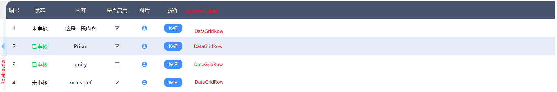
<DataGrid HeadersVisibility="All" RowHeight="60" ColumnHeaderHeight="60" Height="675" ItemsSource="{Binding DataList}">
    <!--<DataGrid.RowHeaderTemplate>
        <DataTemplate>
            <Grid x:Name="iconGrid" Visibility="Collapsed" HorizontalAlignment="Left">
                <Path Width="14" Height="32" Stretch="Uniform" Stroke="Transparent" Data="M0,16 L14,0 L14,32 Z">
                    <Path.Fill>
                        <LinearGradientBrush StartPoint="0,0" EndPoint="1,0">
                            <GradientStop Offset="0" Color="#428EFF" />
                            <GradientStop Offset="1" Color="#00428EFF" />
                        </LinearGradientBrush>
                    </Path.Fill>
                </Path>
            </Grid>
            <DataTemplate.Triggers>
                <DataTrigger Binding="{Binding IsSelected, RelativeSource={RelativeSource AncestorType={x:Type DataGridRow}}}" Value="True">
                    <Setter TargetName="iconGrid" Property="Visibility" Value="Visible"/>
                </DataTrigger>
            </DataTemplate.Triggers>
        </DataTemplate>
    </DataGrid.RowHeaderTemplate>-->
    <DataGrid.Columns>
        <DataGridTemplateColumn Header="编号" Width="80">
            <DataGridTemplateColumn.CellTemplate>
                <DataTemplate>
                    <TextBlock Text="{Binding No}"/>
                </DataTemplate>
            </DataGridTemplateColumn.CellTemplate>
        </DataGridTemplateColumn>
        <DataGridTemplateColumn Header="状态" Width="120">
            <DataGridTemplateColumn.CellTemplate>
                <DataTemplate>
                    <TextBlock Text="{Binding Status}" Foreground="{Binding Status, Converter={StaticResource ColorConverter}}" />
                </DataTemplate>
            </DataGridTemplateColumn.CellTemplate>
        </DataGridTemplateColumn>

        <DataGridTextColumn Binding="{Binding Content}"  Header="内容" Width="350"/>
        <DataGridCheckBoxColumn Binding="{Binding IsEnable}" Header="是否启用" Width="90"/>

        <DataGridTemplateColumn Header="图片" Width="90">
            <DataGridTemplateColumn.CellTemplate>
                <DataTemplate>
                    <Image Source="/Resources/Icon/account2.png" Width="20" Height="20"/>
                </DataTemplate>
            </DataGridTemplateColumn.CellTemplate>
        </DataGridTemplateColumn>

        <DataGridTemplateColumn Header="操作" Width="100">
            <DataGridTemplateColumn.CellTemplate>
                <DataTemplate>
                    <Button Style="{StaticResource ButtonStyleStandard_Blue}" Content="按钮" Width="60" Height="20" />
                </DataTemplate>
            </DataGridTemplateColumn.CellTemplate>
        </DataGridTemplateColumn>
    </DataGrid.Columns>
</DataGrid>


<!--DataGrid.xaml-->
<Style TargetType="DataGrid">
    <Setter Property="IsReadOnly" Value="True"/>
    <Setter Property="AlternationCount" Value="2"/>
    <Setter Property="SelectionMode" Value="Single"/>
    <Setter Property="CanUserAddRows" Value="False"/>
    <Setter Property="CanUserResizeRows" Value="False"/>
    <Setter Property="CanUserSortColumns" Value="False"/>
    <Setter Property="GridLinesVisibility" Value="None"/>
    <Setter Property="AutoGenerateColumns" Value="False"/>
    <Setter Property="CanUserResizeColumns" Value="False"/>
    <Setter Property="CanUserReorderColumns" Value="False"/>
    <Setter Property="CellStyle">
        <Setter.Value>
            <Style TargetType="DataGridCell">
                <Setter Property="BorderBrush" Value="Transparent"/>
                <Setter Property="VerticalAlignment" Value="Stretch" />
                <Setter Property="Template">
                    <Setter.Value>
                        <ControlTemplate TargetType="DataGridCell">
                            <Grid >
                                <TextBlock Padding="15" HorizontalAlignment="Stretch" />
                                <ContentPresenter VerticalAlignment="Center" HorizontalAlignment="Center"/>
                            </Grid>
                        </ControlTemplate>
                    </Setter.Value>
                </Setter>
                <Style.Triggers>
                    <Trigger Property="IsSelected" Value="True">
                        <Setter Property="Foreground" Value="#252736" />
                    </Trigger>
                </Style.Triggers>
            </Style>
        </Setter.Value>
    </Setter>
    <Setter Property="RowHeaderStyle">
        <Setter.Value>
            <Style TargetType="DataGridRowHeader">
                <Setter Property="Template">
                    <Setter.Value>
                        <ControlTemplate TargetType="DataGridRowHeader">
                            <Grid Width="14" Margin="2 0 0 0">
                                <Path x:Name="iconGrid" Visibility="Collapsed" Stretch="Uniform" Stroke="Transparent" Data="M0,16 L14,0 L14,32 Z">
                                    <Path.Fill>
                                        <LinearGradientBrush StartPoint="0,0" EndPoint="1,0">
                                            <GradientStop Offset="0" Color="#428EFF" />
                                            <GradientStop Offset="1" Color="#00428EFF" />
                                        </LinearGradientBrush>
                                    </Path.Fill>
                                </Path>
                            </Grid>
                            <ControlTemplate.Triggers>
                                <DataTrigger Binding="{Binding IsSelected, RelativeSource={RelativeSource AncestorType={x:Type DataGridRow}}}" Value="True">
                                    <Setter TargetName="iconGrid" Property="Visibility" Value="Visible"/>
                                </DataTrigger>
                            </ControlTemplate.Triggers>
                        </ControlTemplate>
                    </Setter.Value>
                </Setter>
            </Style>
        </Setter.Value>
    </Setter>
    <Setter Property="ColumnHeaderStyle">
        <Setter.Value>
            <Style TargetType="DataGridColumnHeader">
                <Setter Property="Background" Value="#45526A"/>
                <Setter Property="Foreground" Value="#FFFFFF"/>
                <Setter Property="HorizontalAlignment" Value="Stretch"/>
                <Setter Property="FontSize" Value="{DynamicResource ContentControlFontSize}" />
                <Setter Property="Template">
                    <Setter.Value>
                        <ControlTemplate TargetType="DataGridColumnHeader">
                            <Border Background="{TemplateBinding Background}"  CornerRadius="0 20 0 0">
                                <ContentPresenter VerticalAlignment="Center" HorizontalAlignment="Center" />
                            </Border>
                        </ControlTemplate>
                    </Setter.Value>
                </Setter>
            </Style>
        </Setter.Value>
    </Setter>
    <Setter Property="RowStyle">
        <Setter.Value>
            <Style TargetType="DataGridRow">
                <Setter Property="BorderBrush" Value="Transparent"/>
                <Setter Property="Background" Value="#FFFFFF" />
                <Setter Property="Foreground" Value="#252736" />
                <Setter Property="FontSize" Value="{DynamicResource ContentControlFontSize}" />
                <Style.Triggers>
                    <Trigger Property="AlternationIndex" Value="0">
                        <Setter Property="Background" Value="#FFFFFF"/>
                    </Trigger>
                    <Trigger Property="AlternationIndex" Value="1">
                        <Setter Property="Background" Value="#FAFAFA"/>
                    </Trigger>
                    <Trigger Property="IsMouseOver" Value="True">
                        <Setter Property="Background" Value="#E7EDF8" />
                    </Trigger>
                    <Trigger Property="IsSelected" Value="True">
                        <Setter Property="Background" Value="#E7EDF8" />
                    </Trigger>
                </Style.Triggers>
            </Style>
        </Setter.Value>
    </Setter>
    <Setter Property="Template">
        <Setter.Value>
            <ControlTemplate TargetType="DataGrid">
                <Border BorderThickness="1" BorderBrush="#D4DCEC" CornerRadius="20 20 20 20" Padding="0 0 0 15">
                    <Grid>
                        <Grid.RowDefinitions>
                            <RowDefinition Height="Auto"/>
                            <RowDefinition Height="*"/>
                        </Grid.RowDefinitions>
                        <Grid.ColumnDefinitions>
                            <ColumnDefinition Width="16"/>
                            <ColumnDefinition Width="*"/>
                        </Grid.ColumnDefinitions>
                        <Border x:Name="RowHeadFlag"  Background="#45526A" Grid.Row="0" Grid.Column="0" CornerRadius="20 0 0 0"/>
                        <DataGridColumnHeadersPresenter Grid.Row="0" Grid.Column="1"/>
                        <!--<ScrollViewer Grid.Row="1" HorizontalScrollBarVisibility="Auto" VerticalScrollBarVisibility="Auto" >
                            <ItemsPresenter />
                        </ScrollViewer>-->
                        <ItemsPresenter Grid.Row="1" Grid.ColumnSpan="2" />
                    </Grid>
                </Border>
            </ControlTemplate>
        </Setter.Value>
    </Setter>
</Style>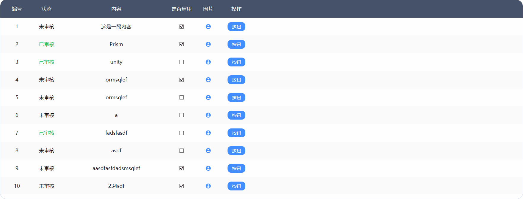
依赖属性与命令
自定义控件
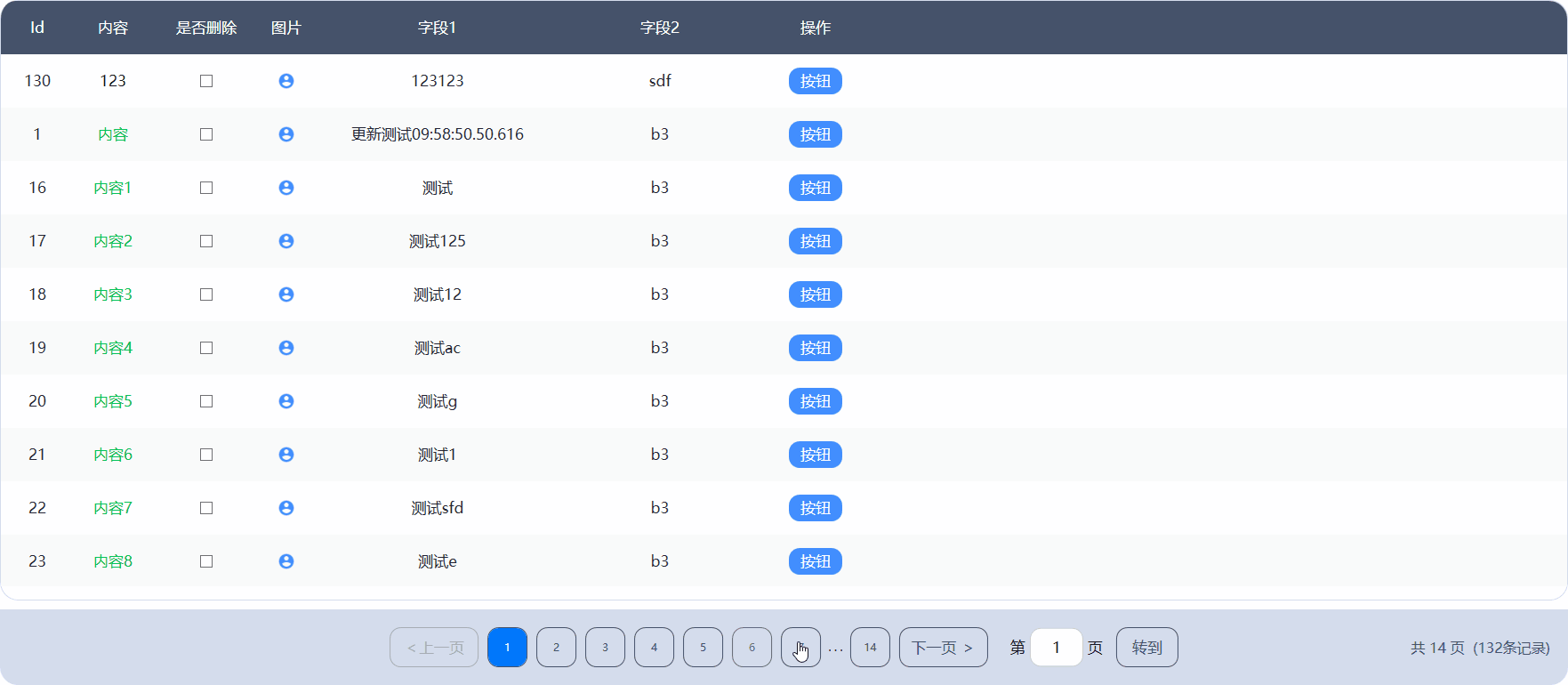
Pagination.xaml
//xaml
<UserControl x:Class="AutoImageAnalysis.Styling.Styles.Controls.Pagination"
             xmlns="http://schemas.microsoft.com/winfx/2006/xaml/presentation"
             xmlns:x="http://schemas.microsoft.com/winfx/2006/xaml"
             xmlns:mc="http://schemas.openxmlformats.org/markup-compatibility/2006"
             xmlns:d="http://schemas.microsoft.com/expression/blend/2008"
             mc:Ignorable="d" d:DesignHeight="450" d:DesignWidth="800" Loaded="UserControl_Loaded">
    <UserControl.Resources>
        <Style TargetType="Button" BasedOn="{StaticResource {x:Type Button}}">
            <Setter Property="MinWidth" Value="45"/>
            <Setter Property="MinHeight" Value="45"/>
            <Setter Property="BorderThickness" Value="1"/>
            <Setter Property="BorderBrush" Value="#45526A"/>
            <Setter Property="Foreground"  Value="#45526A"/>
            <Setter Property="Background" Value="Transparent"/>
            <Setter Property="Template">
                <Setter.Value>
                    <ControlTemplate TargetType="Button">
                        <Border Background="{TemplateBinding Background}" BorderBrush="{TemplateBinding BorderBrush}" CornerRadius="{DynamicResource ControlCornerRadius}" BorderThickness="{TemplateBinding BorderThickness}">
                            <ContentPresenter HorizontalAlignment="Center" VerticalAlignment="Center" />
                        </Border>
                        <ControlTemplate.Triggers>
                            <Trigger Property="IsEnabled" Value="false">
                                <Setter Property="Foreground" Value="#ADADAD"/>
                                <Setter Property="BorderBrush" Value="#ADADAD"/>
                            </Trigger>
                            <Trigger Property="IsMouseOver" Value="true">
                                <Setter Property="Opacity" Value="0.8"/>
                            </Trigger>
                            <Trigger Property="IsPressed" Value="true">
                                <Setter Property="Opacity" Value="0.5"/>
                            </Trigger>
                        </ControlTemplate.Triggers>
                    </ControlTemplate>
                </Setter.Value>
            </Setter>
        </Style>
        <Style TargetType="RadioButton">
            <Setter Property="Margin" Value="5"/>
            <Setter Property="Cursor" Value="Hand"/>
            <Setter Property="MinWidth" Value="45"/>
            <Setter Property="MinHeight" Value="45"/>
            <Setter Property="BorderThickness" Value="1"/>
            <Setter Property="BorderBrush" Value="#45526A"/>
            <Setter Property="Foreground"  Value="#45526A"/>
            <Setter Property="Background" Value="Transparent"/>
            <Setter Property="Template">
                <Setter.Value>
                    <ControlTemplate TargetType="RadioButton">
                        <Border Background="{TemplateBinding Background}" BorderBrush="{TemplateBinding BorderBrush}" CornerRadius="{DynamicResource ControlCornerRadius}" BorderThickness="{TemplateBinding BorderThickness}">
                            <ContentPresenter HorizontalAlignment="Center" VerticalAlignment="Center" />
                        </Border>
                        <ControlTemplate.Triggers>
                            <Trigger Property="IsEnabled" Value="false">
                                <Setter Property="Foreground" Value="#ADADAD"/>
                            </Trigger>
                            <Trigger Property="IsMouseOver" Value="true">
                                <Setter Property="Opacity" Value="0.8"/>
                            </Trigger>
                            <Trigger Property="IsPressed" Value="true">
                                <Setter Property="Opacity" Value="0.5"/>
                            </Trigger>
                            <Trigger Property="IsChecked" Value="True">
                                <Setter Property="Foreground" Value="#FFFFFF"/>
                                <Setter Property="Background" Value="#0177FB"/>
                            </Trigger>
                        </ControlTemplate.Triggers>
                    </ControlTemplate>
                </Setter.Value>
            </Setter>
        </Style>
    </UserControl.Resources>
    <Grid>
        <Border Background="#D4DCEC" CornerRadius="0 0 20 20" Height="85" Margin="0 10 0 0" VerticalAlignment="Center">
            <Grid>
                <Grid.ColumnDefinitions>
                    <ColumnDefinition Width=".5*" />
                    <ColumnDefinition Width="2*" />
                    <ColumnDefinition Width=".5*" />
                </Grid.ColumnDefinitions>
                <StackPanel Grid.Column="1" Orientation="Horizontal" HorizontalAlignment="Center" VerticalAlignment="Center">
                    <Button x:Name="PrevBtn" Click="PrevBtn_Click" Width="100" Content="<上一页" />
                    <StackPanel Name="RBtnPanel" Orientation="Horizontal"/>
                    <Button x:Name="NextBtn" Click="NextBtn_Click" Width="100">下一页  ></Button>
                    <TextBlock Text="第" Margin="20 0 5 0" FontSize="{DynamicResource ContentControlFontSize}"/>
                    <TextBox Width="60" Name="JumpPageNoTxtBx"  TextChanged="JumpPageNoTxtBx_TextChanged" Text="1" HorizontalAlignment="Center" VerticalAlignment="Center"/>
                    <TextBlock Text="页"  Margin="5 0 10 0" FontSize="{DynamicResource ContentControlFontSize}"/>
                    <Button Width="70" x:Name="JumpBtn" Click="JumpBtn_Click" Content="转到"/>
                </StackPanel>
                <StackPanel Grid.Column="2" Margin="0 0 20 0" Orientation="Horizontal" VerticalAlignment="Center" HorizontalAlignment="Right">
                    <TextBlock x:Name="PaginationInfo" FontSize="16" Foreground="#45526A" />
                </StackPanel>
            </Grid>
        </Border>
    </Grid>
</UserControl>
Pagination.cs
//usercontrol
using System;
using System.Collections.Generic;
using System.Linq;
using System.Windows;
using System.Windows.Controls;
using System.Windows.Input;

namespace AutoImageAnalysis.Styling.Styles.Controls
{
    /// <summary>
    /// Pagination.xaml 的交互逻辑
    /// </summary>
    public partial class Pagination : UserControl
    {
        public Pagination() { InitializeComponent(); }

        #region 依赖属性与命令
        public static readonly DependencyProperty PageUpdateCommandProperty = DependencyProperty.Register("PageUpdateCommand", typeof(ICommand), typeof(Pagination), new PropertyMetadata(null));

        /// <summary>
        ///     页面更新命令
        /// </summary>
        public ICommand PageUpdateCommand
        {
            get => (ICommand)GetValue(PageUpdateCommandProperty);
            set => SetValue(PageUpdateCommandProperty, value);
        }


        public static readonly DependencyProperty TotalProperty = DependencyProperty.Register(nameof(Total), typeof(int), typeof(Pagination), new PropertyMetadata(0));

        /// <summary>
        /// 总条数
        /// </summary>
        public int Total
        {
            get => (int)GetValue(TotalProperty);
            set => SetValue(TotalProperty, value);
        }

        public static readonly DependencyProperty TotalPagesProperty = DependencyProperty.Register(
            nameof(TotalPages),
            typeof(int), typeof(Pagination),
            new PropertyMetadata(0, (s, e) =>
            {
                if (s is Pagination pagination && pagination.PageUpdateCommand != null)
                {
                    pagination.Update();
                }
            }));

        /// <summary>
        /// 最大页数
        /// </summary>
        public int TotalPages
        {
            get => (int)GetValue(TotalPagesProperty);
            set => SetValue(TotalPagesProperty, value);
        }

        public static readonly DependencyProperty CurrentPageProperty = DependencyProperty.Register(nameof(CurrentPage),
        typeof(int), typeof(Pagination), new PropertyMetadata(1, PageIndexChanged));
        /// <summary>
        /// 当前页码
        /// </summary>
        public int CurrentPage
        {
            get => (int)GetValue(CurrentPageProperty);
            set => SetValue(CurrentPageProperty, value);
        }
        #endregion

        private static void PageIndexChanged(DependencyObject d, DependencyPropertyChangedEventArgs e)
        {
            if (d is Pagination pagination && pagination.PageUpdateCommand != null)
            {
                pagination.Update();
                pagination.PageUpdateCommand.Execute(e.NewValue);
            }
        }

        private void AddRadioButton()
        {
            int maxVisiblePages = 7;
            List<int> pageNumbers = new List<int>();
            int startPage = Math.Max(CurrentPage - maxVisiblePages / 2, 1);
            int endPage = Math.Min(startPage + maxVisiblePages - 1, TotalPages);

            if (startPage > 1)
            {
                pageNumbers.Add(1);
                if (startPage > 2)
                    pageNumbers.Add(-1); // 插入省略号
            }

            for (int i = startPage; i <= endPage; i++)
            {
                pageNumbers.Add(i);
            }

            if (endPage < TotalPages)
            {
                if (endPage < TotalPages - 1)
                    pageNumbers.Add(-1); // 省略号
                pageNumbers.Add(TotalPages); // 最后一页
            }

            RBtnPanel.Children.Clear();
            foreach (int index in pageNumbers)
            {
                if (index == -1)
                {
                    RBtnPanel.Children.Add(new TextBlock { Text = " . . . " });
                }
                else
                {
                    var radiobtn = new RadioButton
                    {
                        Content = index.ToString(),
                        IsChecked = index == CurrentPage
                    };
                    radiobtn.Click += (s, e) =>
                    {
                        if (s is RadioButton radioButton)
                        {
                            CurrentPage = int.Parse(radioButton.Content.ToString());
                        }
                    };
                    RBtnPanel.Children.Add(radiobtn);
                }
            }
        }

        private void Update()
        {
            if (CurrentPage == 1) //第一页
            {
                PrevBtn.IsEnabled = false;
                NextBtn.IsEnabled = true;
            }
            else if (CurrentPage == TotalPages) //最后一页
            {
                PrevBtn.IsEnabled = true;
                NextBtn.IsEnabled = false;
            }
            else //中间
            {
                PrevBtn.IsEnabled = true;
                NextBtn.IsEnabled = true;
            }
            AddRadioButton();
        }

        #region 页面事件
        private void UserControl_Loaded(object sender, RoutedEventArgs e)
        {
            Update();
            PaginationInfo.Text = $"共 {TotalPages} 页  ({Total}条记录)";
        }

        private void PrevBtn_Click(object sender, RoutedEventArgs e) => CurrentPage--;
        private void NextBtn_Click(object sender, RoutedEventArgs e) => CurrentPage++;
        private void JumpBtn_Click(object sender, RoutedEventArgs e)
        {
            int jumpNo = int.Parse(JumpPageNoTxtBx.Text);

            if (jumpNo < 1) { jumpNo = 1; JumpPageNoTxtBx.Text = "1"; }
            else if (jumpNo > TotalPages) { jumpNo = TotalPages; JumpPageNoTxtBx.Text = TotalPages + ""; }
            CurrentPage = jumpNo;
        }

        private void JumpPageNoTxtBx_TextChanged(object sender, TextChangedEventArgs e)
        {
            if (sender is System.Windows.Controls.TextBox textBox)
            {
                string txt = textBox.Text;
                bool isNumeric = int.TryParse(txt, out _);
                if (!isNumeric)
                {
                    int caretIndex = textBox.CaretIndex;
                    textBox.Text = new string(textBox.Text.Where(char.IsDigit).ToArray());
                    textBox.CaretIndex = caretIndex - 1 < 0 ? 0 : 1;
                }
            }
        }
        #endregion
    }
}
前端使用
MainWindow.xaml
<df:Pagination CurrentPage="{Binding PageEntity.PageIndex}" Total="{Binding PageEntity.Total}" TotalPages="{Binding PageEntity.TotalPages}" PageUpdateCommand="{Binding PageUpdatCommand}" />MainWindowViewModel.cs
private PageEntity _pageEntity=new PageEntity();
public PageEntity PageEntity
{
    get => _pageEntity;
    set => SetProperty(ref _pageEntity, value);
}
private DelegateCommand<int?> _pageUpdatCommand;
public DelegateCommand<int?> PageUpdatCommand => _pageUpdatCommand ?? (_pageUpdatCommand = new DelegateCommand<int?>(PageUpdate));
private void PageUpdate(int? i)
{
    PageEntity.PageIndex = i.Value;
	LoadData();
}
非按钮绑定命令
<StackPanel HorizontalAlignment="Center"
            VerticalAlignment="Center"
            Cursor="Hand"
            Orientation="Vertical">
    <StackPanel.InputBindings>
          <MouseBinding Command="{Binding TobeMarkCommand}" MouseAction="LeftClick" />
    </StackPanel.InputBindings>
    <StackPanel HorizontalAlignment="Center" Orientation="Horizontal">
          <TextBlock VerticalAlignment="Bottom"
                    FontSize="60"
                    FontWeight="Bold"
                    Foreground="#363950"
                    Text="{Binding WorkbenchViewItems.UnmarkCount}" />
    </StackPanel>
</StackPanel>
绑定按键
<UserControl x:Class="MorphoScan.Modules.MainModule.Views.Login"
             xmlns="http://schemas.microsoft.com/winfx/2006/xaml/presentation"
             xmlns:x="http://schemas.microsoft.com/winfx/2006/xaml"
             xmlns:ex="clr-namespace:MorphoScan.Common.UiCore.Attach;assembly=MorphoScan.Common.UiCore"
             xmlns:prism="http://prismlibrary.com/"
             prism:ViewModelLocator.AutoWireViewModel="True">
    <UserControl.InputBindings>
        <KeyBinding Key="Enter" Command="{Binding LoginCommand}" />
    </UserControl.InputBindings>

    ...

    <Button Width="380"
                Height="51"
                Margin="100,85,0,0"
                Background="#0177FB"
                Command="{Binding LoginCommand}"
                Content="登录"
                Foreground="White" />

</UserControl>